

1. Introduction
Background
Mirror is a successful brick and mortar clothing store that caters to everyone’s needs and style whether it be formal, casual, business or athletic with a price that is affordable. They currently do not have a web presence. Mirror would like to revamp their brand with a new logo and have a responsive e-commerce site to go along with their new look.
Research Goals
My goal is to learn about competitor companies such as Old Navy, H&M, Uniqlo, and Cotton-On, to see what trends they are following in terms of their overall design layout. I will review placement of check out, product sizing, shipping details, navigation or search bar. I will also research other high end retailers to find inspiration in their design such as J Crew, Banana Republic, Zara, Spring.
Methodologies
The research methods I will utilize consists of market research, user interviews, and contextual inquiries.
Participants
My ideal participants for this project would any race ages 18-65. College student with a part-time job, a new reporter in his late 20’s, an office employee mid 30’s in a design company, a salesman in his 40’s, and a retired grandfather is his 60’s that still dresses trendy, is tech savvy but is also a bargain hunter.

Empathy Research
5 participants were used for the research:
Research Debrief: Mirror
One of the common factors that all participants shared is the use of their iPhone for e-commerce whether it’s to search or purchase products.
4 out of 5 almost always prefer making their purchases online for clothing because they did not like the crowded stores and weak customer service associates.
2 out of 5 were concerned about fitment as well as the return/exchange process being time consuming.
1 out of 5 used his smartphone predominantly for searching but would not purchase because he felt the process to be very cumbersome and it involved too many steps.
3 out of the 5 really enjoyed how the store made them feel as one stated as if she were in a boutique in a fancy house.
Positive experiences
Store décor very inviting with music and comforting colors.
They also shared fast check outs except for one participant.
Negative experience
All of the participants shared a disappointment regarding crowded stores and weak customer service associates. This is a little hard to address because most of these stores hire high school students and they don’t take their job as serious as someone the really needs it so turnover is fast resulting with inconsistent customer service. The managers should devise a stronger vetting process to employ better quality candidates but again this may not work because most stores need employees as soon as possible.
One participant did not trust the mobile app for purchases as well as experiencing a cumbersome check out process. I would think a better solution for this problem would be for the retailer to devise a streamline check out process without so many steps in order to finalize purchases easier, especially for older customers that predominantly shop at brick and mortar locations.
2. Information Architecture
To ensure I have a proper information architecture for the design, I used the diagram below to help me in organizing the IA of the site.
IA Planning

Sitemap

Ideations of possible Landing pages

Empathy Map

Persona

Storyboard
The storyboard below illustrates a day in our persona’s life contemplating on going to the mall to purchase clothing or utilizing Mirror’s e-commerce site to complete

Goals

3. Interaction Design
Task Flow

User Flow
We compiled all of the information obtained from our user research and were able to produce the following deliverables.

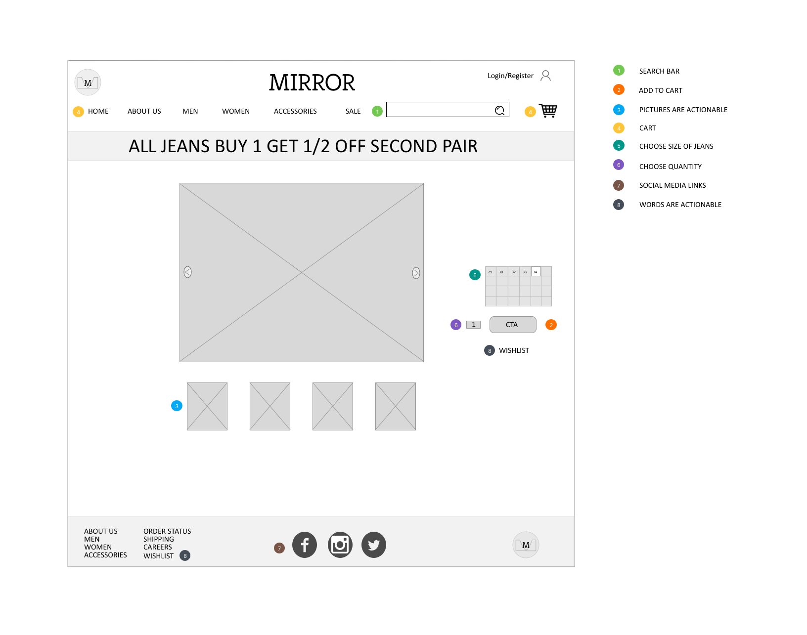
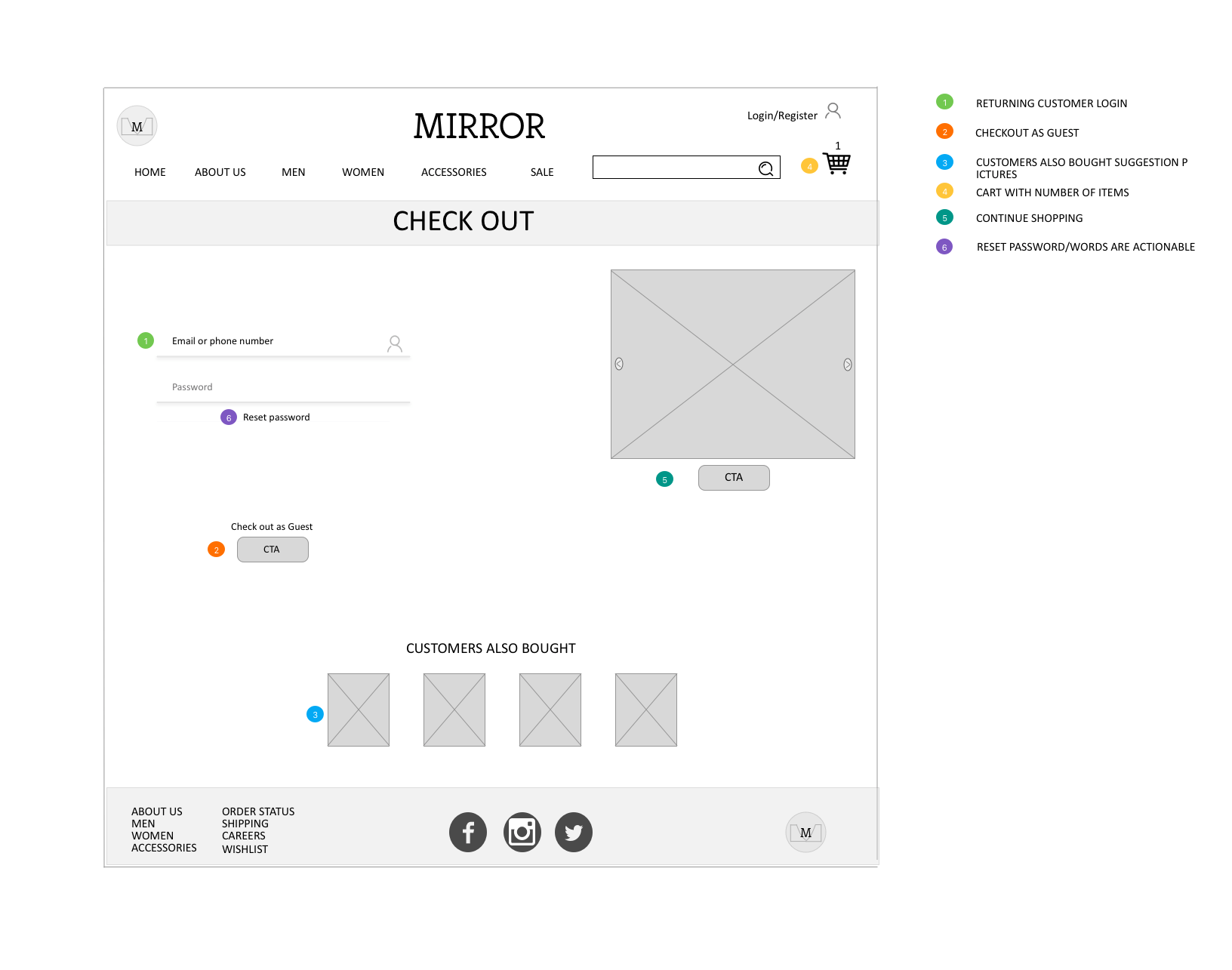
Lo Fi Wireframes
The following wireframes illustrate desktop landing page, product page, and checkout page.

Lo Fi Prototype
The prototype below illustrates the search page, product page, and check out process.

Style Tile Mirror UI Kit


Responsive Designs
Here we can see the finalized UI kit implemented into the responsive design.
