
1. Introduction
Background
Chase, owned by JP Morgan, has the mission is to empower customers’ lives by creating engaged, lifelong relationships. Chase would like to focus on their mobile app. Millennials and younger generation expect to have everything at their fingertips and are always on the go. Chase wants to take advantage of this opportunity to engage millennials with their financial needs
Research Goals
I am looking to learn about competitor companies such as Bank of America, Wells Fargo, and Citizens Bank to see what trends they are following with their overall design layout for budget feature. I will review placement of budget option and well flow of information architecture to reveal any pains that could be avoided while designing Chase’s budget add-on.
Methodologies
The research methods I will use are market research, user interviews, contextual inquiries.
Participants
My ideal participants for this project would any race ages 18-65. College student with a part-time job, a barista in his or her late 20’s, an office employee mid 30’s in a financial company, a salesman in his 40’s. I will begin my research with user interviews to get a solid foundation of pros and cons about competitor sites, contextual inquiries to know how user friendly a site is, and market research to check competitor’s success rates.

Empathy Research
5 participants were used for the research:
Research Debrief: Mirror
One of the common factors that all participants shared is the use of their iPhone for e-commerce whether it’s to search or purchase products.
4 out of 5 almost always prefer making their purchases online for clothing because they did not like the crowded stores and weak customer service associates.
2 out of 5 were concerned about fitment as well as the return/exchange process being time consuming.
1 out of 5 used his smartphone predominantly for searching but would not purchase because he felt the process to be very cumbersome and it involved too many steps.
3 out of the 5 really enjoyed how the store made them feel as one stated as if she were in a boutique in a fancy house.
Positive experiences
Store décor very inviting with music and comforting colors.
They also shared fast check outs except for one participant.
Negative experience
All of the participants shared a disappointment regarding crowded stores and weak customer service associates. This is a little hard to address because most of these stores hire high school students and they don’t take their job as serious as someone the really needs it so turnover is fast resulting with inconsistent customer service. The managers should devise a stronger vetting process to employ better quality candidates but again this may not work because most stores need employees as soon as possible.
One participant did not trust the mobile app for purchases as well as experiencing a cumbersome check out process. I would think a better solution for this problem would be for the retailer to devise a streamline check out process without so many steps in order to finalize purchases easier, especially for older customers that predominantly shop at brick and mortar locations.
2. Information Architecture
To ensure I have a proper information architecture for the design, I used the diagram below to help me in organizing the IA of the site.
Persona

3. Interaction Design
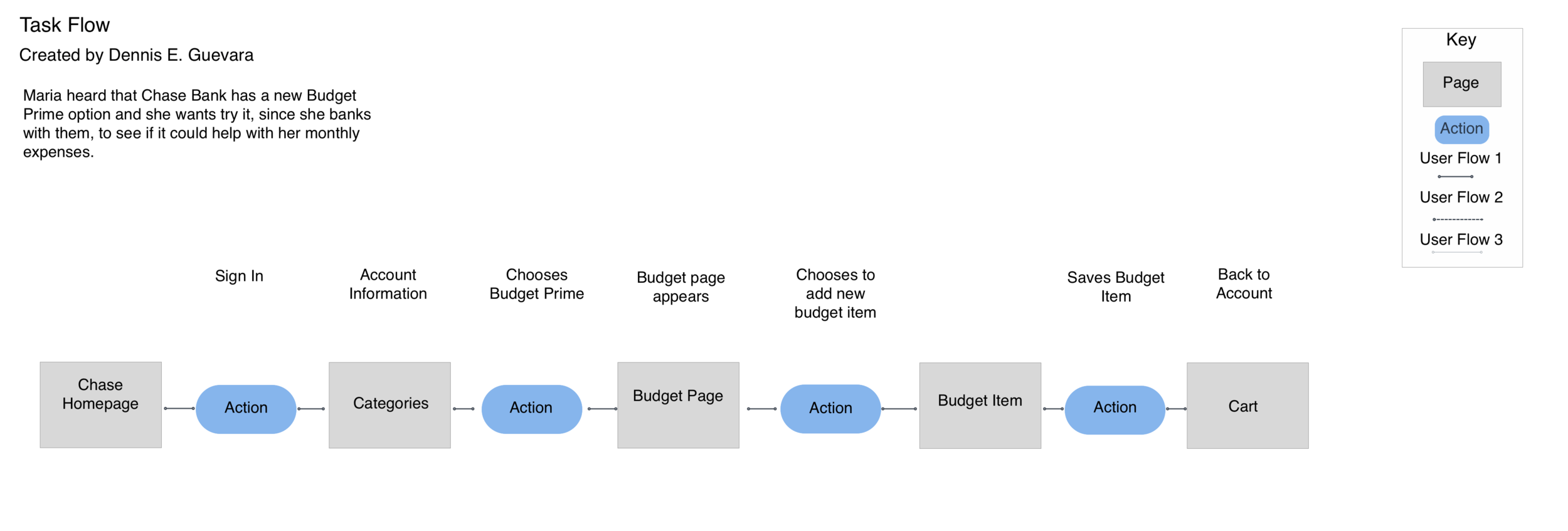
Task Flow
Lo Fi Wireframes
The following wireframes illustrate desktop landing page, product page, and checkout page.

Responsive Designs
Here we can see the finalized UI kit implemented into the responsive design.
